

Open almost any storefront and something is competing for your eyes. A timer counting down to a deadline that resets tomorrow. A badge insisting four other people are looking at this. A banner sliding over the thing you were trying to read.
These tactics exist because they work. Pressure reliably lifts short-term conversion. The question nobody asks in the same meeting is what it costs, and the cost lands somewhere that quarterly dashboards do not show.
Urgency borrows from tomorrow
A manufactured deadline converts by shortening deliberation. That is the whole mechanism. It does not make the item more suitable, it makes you decide before you are ready.
Some of those decisions were going to happen anyway, so the lift looks real. The rest turn into returns, buyer's remorse, and a quiet note-to-self that this shop pushes. Do it long enough and you have trained your best customers to distrust your signals, including the honest ones.

Cognitive load is the real conversion killer
The irony is that most storefronts do not lose sales to competitors. They lose them to confusion. Too many near-identical options, unclear differences, hidden costs surfacing at the last step.
Usability research keeps landing on the same conclusion: friction in comprehension, not lack of motivation, is what stalls purchases. Studies of checkout usability have consistently found that a large share of abandonment traces back to avoidable interface and clarity problems rather than price.
Which means the highest-leverage work is usually subtraction. Fewer choices, clearer distinctions, costs shown early.
What calm looks like in practice
It is less a style than a set of refusals. No countdown that does not correspond to something real. No stock figure we cannot stand behind. Prices that include what you will actually pay. Descriptions that name the compromise, because everything has one.
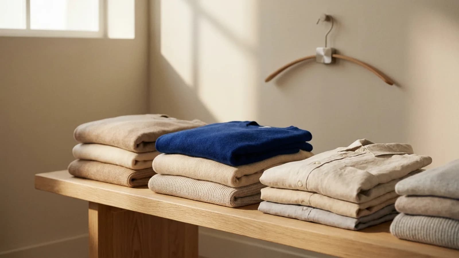
Then some additions. Enough whitespace that images can be looked at. Photography that shows scale and texture rather than shouting. A category you can scan in one pass instead of scrolling for a minute.

The slower payoff
Calm converts worse this week and better this year. That is a genuinely difficult trade to make, and most organisations resist it, because the cost of urgency is invisible while its benefit is measurable.
The compounding upside is that a shopper who was not pressured comes back without being retargeted. That is the same underlying bet we describe in what loyalty means when everything is personalised: consistency outperforms cleverness given enough time.
An easy test
Look at any product page and ask which elements exist to help you decide and which exist to stop you thinking. It is usually obvious within seconds, and once you can see it you cannot unsee it.
We would rather you took your time. Browse home and kitchen or accessories slowly, close the tab, and come back tomorrow if you want to. The item will still be there at the same price, which is the least a shop can offer.